My Dashboards
My Dashboards is where you build your own views of your data. A dashboard is a grid of widgets, each one reading from the devices and sensors you point it at. You choose the widgets, the layout, the time window and who can see the result.
"Which sensors are outside their thresholds right now?" — the assistant answers from your own data, in the app or in Slack. See Ask SensoCAN.
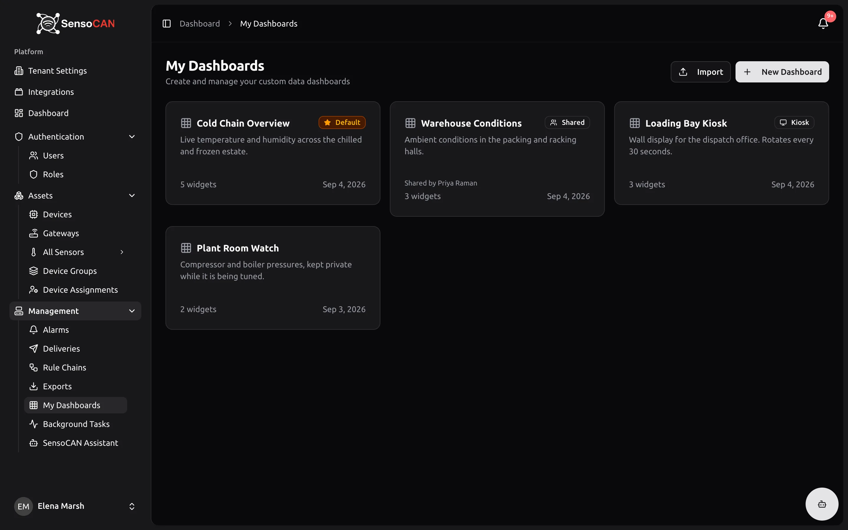
Open it from Management → My Dashboards. The page lists the dashboards you created plus any a teammate shared with your organisation, sorted so your default dashboard comes first and the rest follow by most recently updated.
Each card shows the name, description, widget count and last-updated date, plus the badges that apply: Default, Shared (visible to your organisation), Kiosk (a public link is on) and Shared by with the owner's name when the dashboard is not yours.
Creating a dashboard
- Select New Dashboard.
- Give it a Name (required) and, optionally, a Description.
- Turn on Set as default if you want this dashboard pinned to the top of the list and badged Default. Only one dashboard can be your default; setting a new one clears the previous.
- Select Create Dashboard. SensoCAN saves it and opens it straight away.
An empty dashboard shows No widgets yet. Select Add Widget to place the first one. The button is unavailable until your organisation has at least one device.
Import on the list page loads a dashboard someone exported from SensoCAN as a .json file. Imports always arrive private and never as your default, and a binding pointing at a device your organisation does not have is kept and flagged unresolved so you can repoint it. From an open dashboard, the toolbar also offers Export (downloads the layout for importing elsewhere) and Duplicate (a private copy, opened for you).
Everything you build is yours to edit. A dashboard a teammate shared with you is read-only: you will see a banner saying they shared it with your organisation and that you can view but not change it.
Editing a dashboard
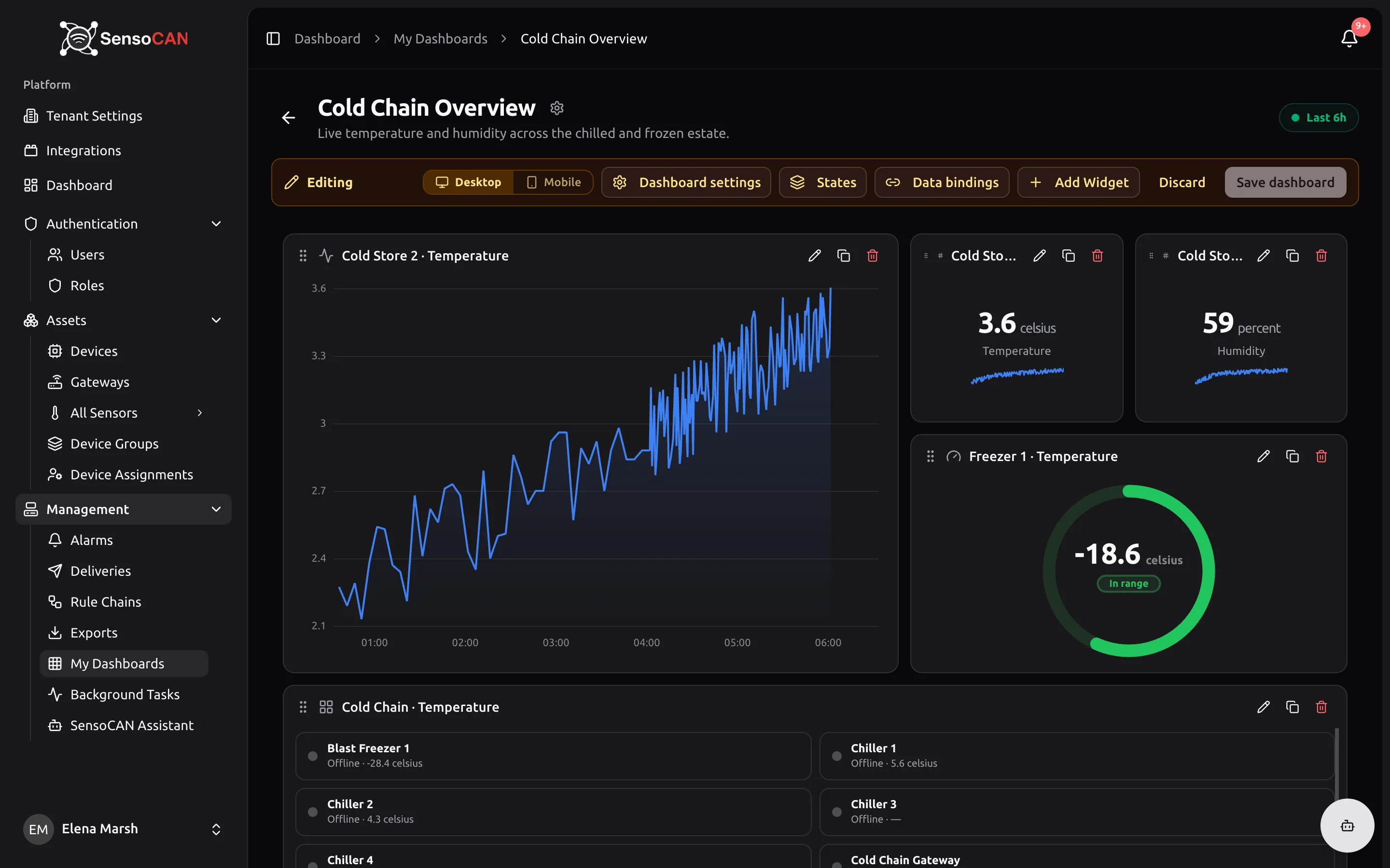
Select Edit Dashboard to start an edit session. SensoCAN takes a working copy: an amber bar reads Editing, then Unsaved changes once you touch something, and nothing is stored until you select Save dashboard. Discard throws the whole draft away.
The edit bar gives you a Desktop / Mobile toggle (the mobile view edits a single-column phone-width layout), a Current state switcher when the dashboard has more than one state, and buttons for Dashboard settings, States, Data bindings and Add Widget.
While editing, each widget gains a drag handle for moving and resizing plus three buttons: a pencil that opens the configuration panel, a duplicate button that drops a copy at the bottom of the grid, and a delete button that asks Remove widget? before taking it out of the draft.
The widget library
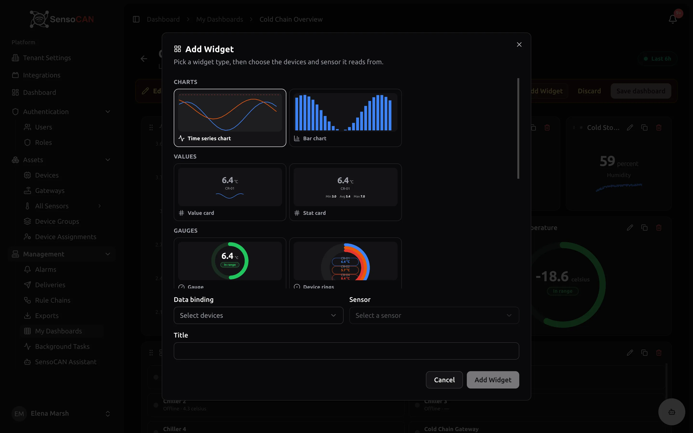
Selecting Add Widget opens a library grouped into the categories the interface uses, each type shown with a live sample preview. Pick a type, then choose the Data binding (which devices it reads) and the Sensor, and SensoCAN suggests a Title you can overwrite.
Charts
- Time series chart — values over the selected window as lines, one series per device and sensor. Dashed red threshold lines appear when every series shares the same limits, and the axis stays pinned to your window so gaps in the data are visible.
- Bar chart — the same data drawn as bars, useful for aggregated buckets such as hourly averages.
Values
- Value card — the latest reading in large type with its unit and label, shown in red when it breaches a threshold, with a small sparkline once there are at least two points and an optional change line comparing against an earlier period.
- Stat card — the same latest value, but with Min, Avg and Max over the window instead of the sparkline.
Gauges
- Gauge — a ring showing the latest value against a scale derived from the sensor's thresholds, with coloured zones. Without thresholds the scale simply brackets the current value.
- Device rings — up to three rings side by side for the first three series in the widget, each with its own thresholds. Reads from several devices at once.
Alarms
- Alarm table — a row for every sensor currently above its maximum or below its minimum, badged Above max or Below min, with the value in red and a Since column giving the start of the run. When nothing is in breach it shows a green 0 — No active alarms.
- Alarm count — just the number of sensors in breach, in red, with a subtitle splitting it into how many are above the maximum and how many below the minimum.
Status
- Status grid — one tile per device with a coloured dot and a label of Alarm, Online or Offline, plus its latest readings. Breaching tiles get a red border.
Tables
- Table — the most recent readings newest first, with Time, the series label and the Value with its unit. Values outside their thresholds are shown in red.
Every widget type shares the same empty behaviour: No data in this time window (with the timestamp of the last reading, if the sensor has older data) or No data available. An alarm widget therefore never claims zero alarms when it simply has nothing to read. A widget you have not pointed at anything yet says No data binding yet — configure this widget.
The widget configuration panel
The pencil on a widget opens a panel with an Advanced mode / Basic mode toggle and these tabs.
Data — one or more datasources. Each picks a data binding and one or more sensor keys, and you can Add key or Add datasource to combine several readings in one widget. In Advanced mode each key opens up further: Label, Color, Units, Decimals, a Delta vs earlier period switch that compares against the previous interval, yesterday, last week or last month and displays the result as an absolute change, a percentage or the previous value, and a Post-processing field for adjusting each point before it is drawn (returning nothing drops the point).
Actions — makes the widget interactive. See Widget actions below.
Appearance — switches for Legend, Area fill and Threshold lines, overriding what the widget would choose on its own. This tab appears in Advanced mode only.
Card — the widget Title and the Card style: Default draws the usual bordered card, Transparent drops the border and background when viewing so the widget blends into the dashboard.
Data bindings
A binding is the rule that decides which devices a widget reads. Open Data bindings in the edit bar to manage them. Widgets you add from the library create a binding for you automatically, badged auto.
Each binding has a name and a Resolves by type:
- Single device — one named device.
- Device list — a hand-picked set of devices.
- Device name prefix — every device whose name starts with the text you type.
- All devices — the whole fleet.
- Device group — a device group, optionally narrowed further by a name prefix.
- Devices by sensor type — every device that has a sensor of the type you choose.
- Device from state — the device carried by the current dashboard state when someone drills down.
The Resolve to multiple devices switch controls whether the binding returns everything it matches or only the first match. As you edit, a Resolves to preview lists the devices it currently matches, so you can see the result before saving. Each binding shows how many widgets use it, and one that is in use cannot be deleted until you repoint those widgets.
States and navigation
A dashboard can have several states — think of them as its screens. Open States from the edit bar to rename them, duplicate them, add a New state, or choose Make home to decide which one opens first. Every dashboard has exactly one home state, and the home state cannot be deleted. Deleting any other state also removes the widgets only that state used, so it is worth saving a copy first if you are unsure.
States are how drill-down works. A widget action can open another state and carry the device you clicked with it, and any Device from state binding on that screen then resolves to that device. Use ${deviceName} or ${deviceId} in a state name or a widget title and SensoCAN substitutes the drilled-into device when you get there.
When you are viewing a dashboard and drill in, a breadcrumb trail appears above the grid; select an earlier crumb to go back. Your position is kept in the page address, so refreshing, using the browser back button or sharing the link lands on the same screen.
Widget actions
The Actions tab turns clicks into navigation. Each action has a Trigger and an Action.
Triggers depend on the widget: Row click for the table, alarm table and status grid; Point click for the time series and bar charts; Card click for the widget as a whole; and Header button, which adds a labelled button to the widget header. You can have one action per trigger, except header buttons, which can stack.
The actions available are:
- Navigate to state — opens another state, carrying the clicked device. The widget's own state is excluded from the target list.
- Update current state — stays where you are but swaps the carried device, so Device from state bindings switch to whatever you clicked.
- Open device page — jumps to the full device page.
- Open URL — opens an address you supply, which may include the
${deviceId}and${deviceName}placeholders, optionally in a new tab.
If the dashboard has only one state, SensoCAN tells you to create another state first, because drilling needs somewhere to open.
The time window
Every dashboard has a time window, shown as a pill in the toolbar with a green pulsing dot while it is live. Select it to open the picker.
Realtime keeps the window rolling up to now and refreshes every 30 seconds; when aggregation is set to None, new readings also arrive as they land. History looks at a period that has already passed.
The quick presets are Last 15m, 30m, 1h, 6h, 12h, 1d, 7d and 30d. The relative presets follow the calendar: This hour, Today, This week, This month, Yesterday, Last week and Last month — and they roll over on their own as each boundary passes. In History you can also set a Fixed range with From and To.
Below that, Aggregation chooses the function used to summarise each bucket — None, Average, Minimum, Maximum, Sum or Count — while Grouping sets the bucket size (Auto, or 1 minute, 5 minutes, 15 minutes, 1 hour or 1 day) and Max values caps how many points a widget asks for.
Timezone decides where a calendar preset starts. Leave it on Browser timezone to follow the machine you are sitting at, or pick a named zone so that "Today" means the same thing for everyone looking at the dashboard.
Changes you make in the picker are temporary — the hint reads "Changes reset on reload unless saved". If you own the dashboard and can edit it, use Save as default in the picker to make the current window the one everyone sees when they open it.
Dashboard settings
Dashboard settings in the edit bar covers grid geometry and what viewers are allowed to do. Changes save with the dashboard.
Under Grid you choose the number of Columns (12, 24 or 48), the Margin between widgets and the Row height, all in pixels. Below roughly 640 pixels of width the grid switches to a single-column mobile layout, which you can arrange yourself with the Mobile toggle in the edit bar.
Under Time window:
- Show time window — whether viewers see and use the time window control.
- Allow history mode — whether viewers may switch from realtime to historical ranges.
- Lock aggregation — when on, viewers cannot change the function, grouping or max values.
A Kiosk display section appears once the dashboard has more than one state, with Rotate states every (seconds). Leave it empty to stay on the home state.
Sharing and kiosk links
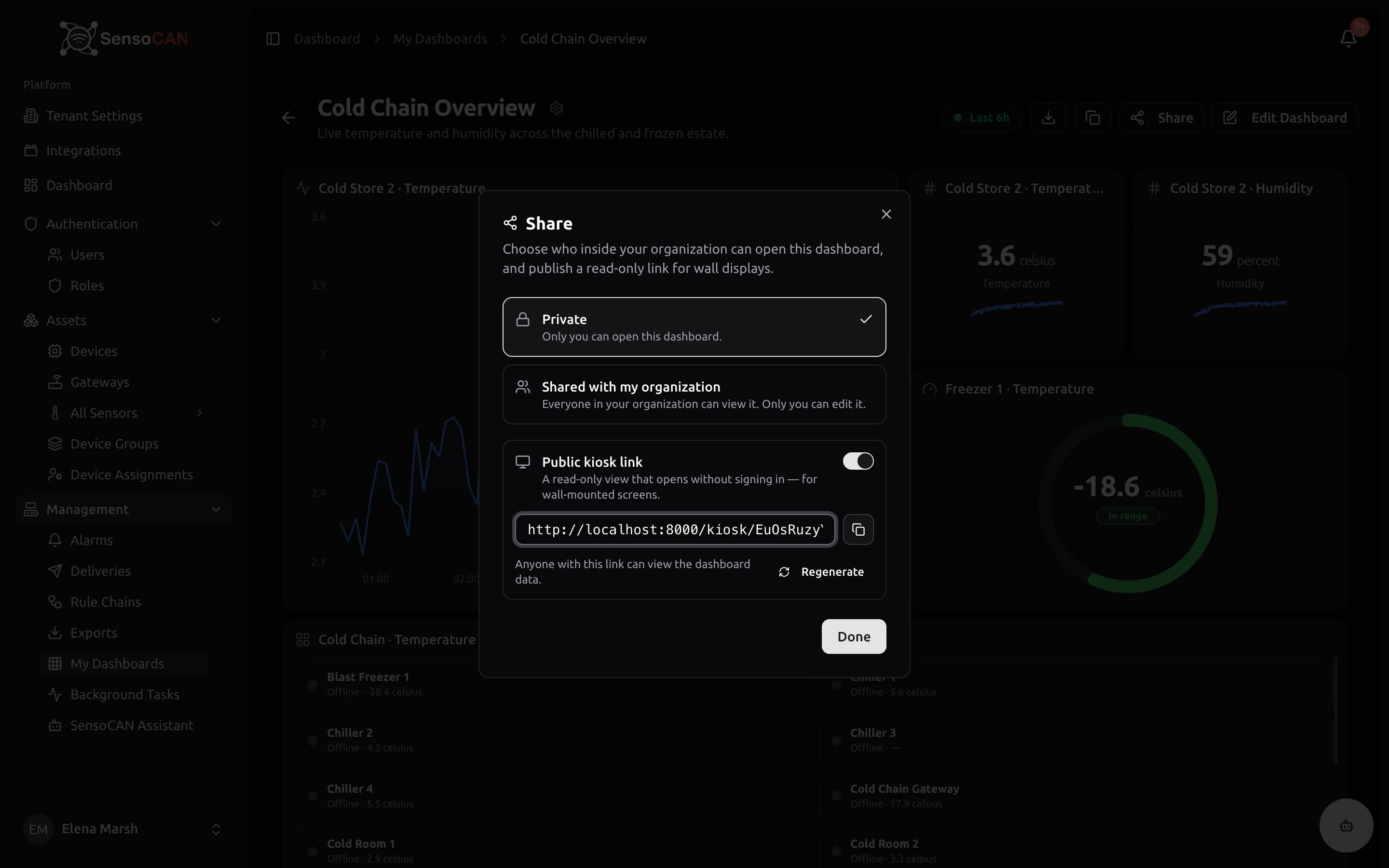
Select Share (owner only) to choose who can open the dashboard:
- Private — only you can open this dashboard.
- Shared with my organization — everyone in your organisation can view it; only you can edit it.
Below that, the Public kiosk link switch publishes a read-only view that opens without signing in, intended for wall-mounted screens. Turning it on reveals the link with a Copy link button, alongside the warning that anyone with the link can view the dashboard data. The link carries a long random token, so treat it like a password: anyone who has it gets in.
The link stays valid until you act. Switching Public kiosk link off stops the old address working immediately, and Regenerate issues a fresh link and kills the previous one. Re-enabling the switch reuses the same link unless you regenerated it, and a kiosk link is never included when you export a dashboard.
A kiosk viewer sees a full-screen dark rendering of the dashboard: its name, the current state name, a live dot with the window label, and the widgets themselves in the desktop layout, refreshing every 30 seconds. There is no sign-in, no editing, no drill-down and no time-window control — the kiosk uses the window you saved. If you set a rotation interval, the view cycles through the states with progress dots, skipping any state that needs a drilled-into device.
Permissions
Viewing, creating, editing and deleting dashboards are separate rights, and deleting only ever applies to dashboards you own. If a button described here is missing, your role may not include it — see Roles and permissions.
Related pages
- Devices and Sensors — what widgets read from
- Alarms — the thresholds behind the alarm widgets
- Exports — taking readings away as a file
- Account settings — your profile timezone